

 Appointments



Brand Logo Scroll - Standard Version
Please use the below Html structure for a standard brand logo scroll area:










Checkerboards
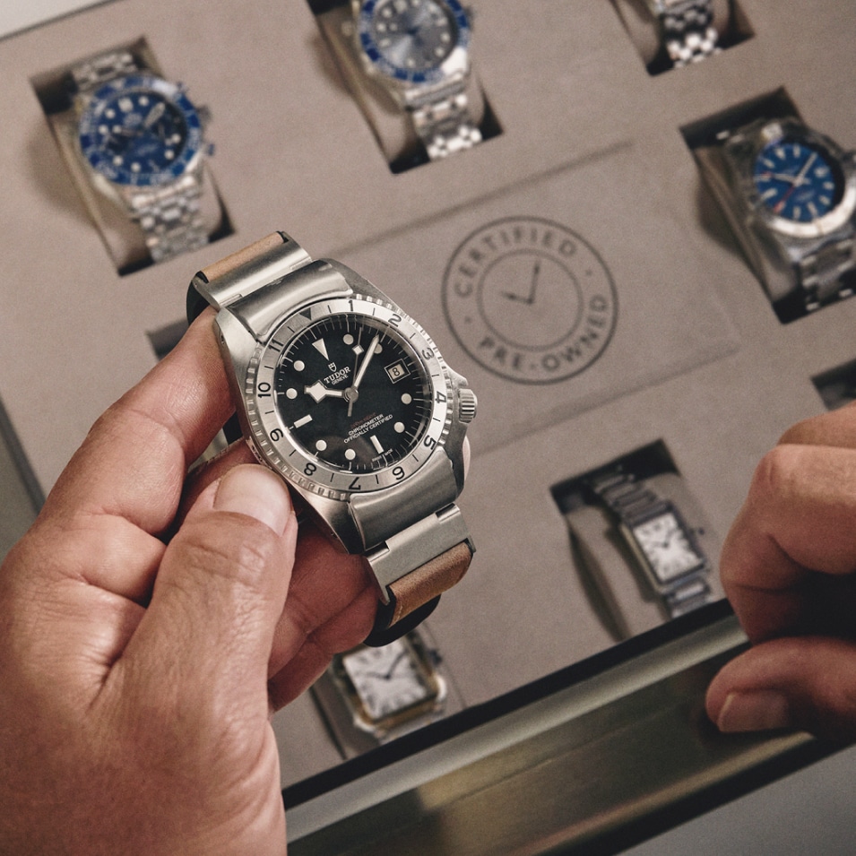
Standard Checkerboard Component image on the left and text on the right.
Text is left aligned on WOS (used on pre-owned page) - if you ever need it centered add the class text-center into the html next to the class cb-text
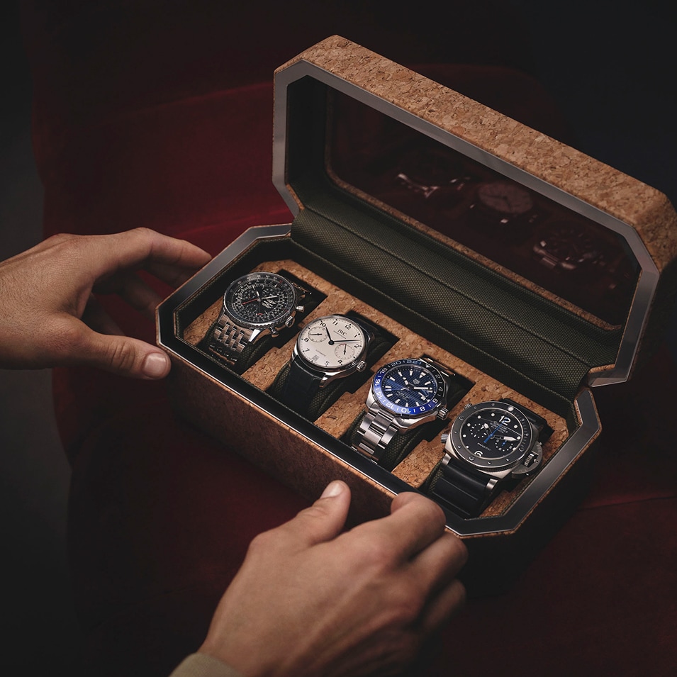
Please make Image 955 by 955.
Span before the title needs the class cb-pre-title for correct styling.
Html variations:
Lorem Ipsum
Lorem ipsum dolor sit amet, consectetur adipiscing elit, sed do eiusmod tempor incididunt ut labore et dolore magna aliqua. Ut enim ad minim veniam, quis nostrud exercitation ullamco laboris nisi ut aliquip ex ea commodo consequat. Duis aute irure dolor in reprehenderit in voluptate velit esse cillum dolore eu fugiat nulla pariatur. Excepteur sint occaecat cupidatat non proident, sunt in culpa qui officia deserunt mollit anim id est laborum.
Lorem ipsum dolor sit amet consectetur adipiscing elit. Quisque faucibus ex sapien vitae pellentesque sem placerat. In id cursus mi pretium tellus duis convallis.also a link
Link exampleCheckerboards with Text First
To have the text first add the class checkerboard-text-first to the start of the container next to the class wosgCheckerboard-component like in the below Html:
Lorem Ipsum
Lorem ipsum dolor sit amet, consectetur adipiscing elit, sed do eiusmod tempor incididunt ut labore et dolore magna aliqua. Ut enim ad minim veniam, quis nostrud exercitation ullamco laboris nisi ut aliquip ex ea commodo consequat. Duis aute irure dolor in reprehenderit in voluptate velit esse cillum dolore eu fugiat nulla pariatur. Excepteur sint occaecat cupidatat non proident, sunt in culpa qui officia deserunt mollit anim id est laborum.
Lorem ipsum dolor sit amet consectetur adipiscing elit. Quisque faucibus ex sapien vitae pellentesque sem placerat. In id cursus mi pretium tellus duis convallis.
Checkerboards with Quote
For Quotes - use the below Html structure
“Lorem ipsum dolor sit amet, consectetuer adipiscing elit. Aenean commodo ligula eget dolor.”
Quoters Name
Quoters Occupation
Checkerboards with List
For Lists - please use the below Html structure - if you do not need the check mark just delete the span in each li element
Lorem Ipsum
- Integer tincidunt. Cras dapibus
- Vivamus elementum semper nisi.
- Aenean vulputate eleifend tellus
- Aenean leo ligula, porttitor eu, consequat vitae, eleifend ac, enim.
- Aliquam lorem ante, dapibus in, viverra quis, feugiat a, tellus.
Checkerboards with Video
For a Checkerboard with Video please use the below Html or use any of the above and replace the cb-image div with the cb-video div from the below Html.
Video must be mp4.
Make sure to change the poster image for each video
The video has aspect ratio: 1 / 1; to make the video appear square when using a portrait video that is too big for the component. This can be removed from the html if needed.
The Javascript for this component auto plays once the user scrolls to the video on the page. If you don't want this just don't add the Javascript to the page and delete the class auto-play-wosg-video from the html.
Please only add the Javascript in this component to a page once. Even if you have more than one of these video components on a page.
If you have more than one place the Javascript in the last component of this type on the page.
Lorem Ipsum
Lorem ipsum dolor sit amet, consectetur adipiscing elit, sed do eiusmod tempor incididunt ut labore et dolore magna aliqua. Ut enim ad minim veniam, quis nostrud exercitation ullamco laboris nisi ut aliquip ex ea commodo consequat. Duis aute irure dolor in reprehenderit in voluptate velit esse cillum dolore eu fugiat nulla pariatur. Excepteur sint occaecat cupidatat non proident, sunt in culpa qui officia deserunt mollit anim id est laborum.
Lorem ipsum dolor sit amet consectetur adipiscing elit. Quisque faucibus ex sapien vitae pellentesque sem placerat. In id cursus mi pretium tellus duis convallis.
Centralised Component
To have a centralised component - please use the html structure below - padding on the text area can be amended with inline styling if it needs to be changed from the CSS
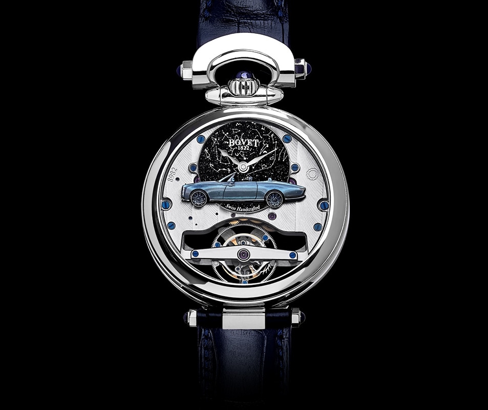
One of a kind gifts
Sometimes only a unique piece will do. Perhaps the occasion is so special it demands a bespoke creation, or perhaps you have a treasured family heirloom you wish to have remodelled or restored. For these occasions and many others, we can assist you with our bespoke service.
Product with Hero Image
Standard Product with Hero Image Component - Image on the right and product on the left.
Standard version shows 4 products and products scroll horizontally on tablet / mobile
Html variations:

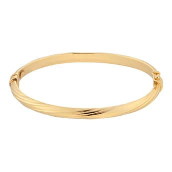
Product with Hero Image - Image First
To have the Hero Image on the left on desktop add the class productRight onto the main container after the class wosgProductWithHeroImg
Product with Hero Image - Scrolling Product Desktop
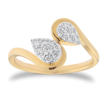
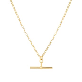
To make the product scroll vertically on desktop add at least 6 products and add the class scrollProductDesktop to the components main container after the class wosgProductWithHeroImg or use the below HTML:
Product with Hero Image - Button Link
To have a button as the link instead of the standard underlined version - please use the below Html, change the colour of the button in the inline styling in the html
Product with Hero Image - Text on Hero Image
To have text on the Hero image instead please use the below Html:
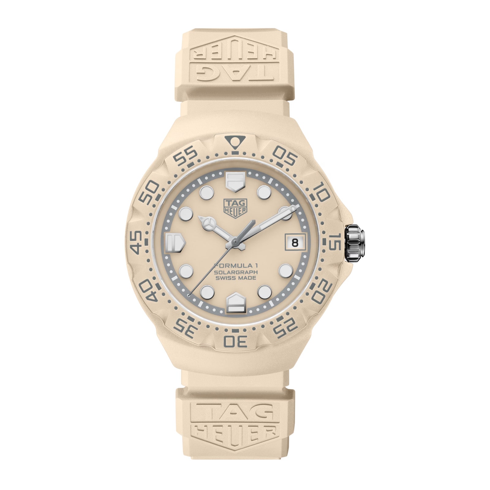
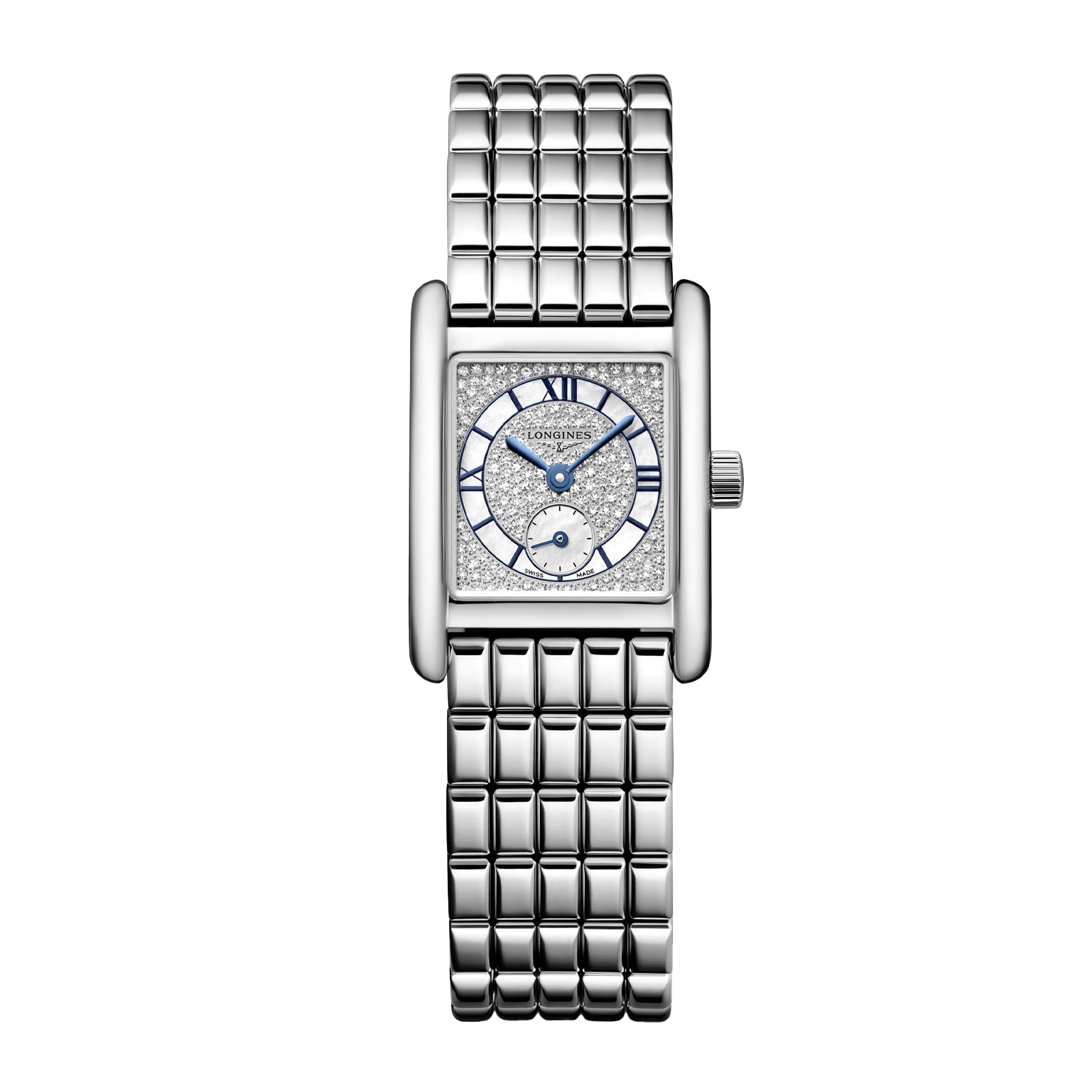
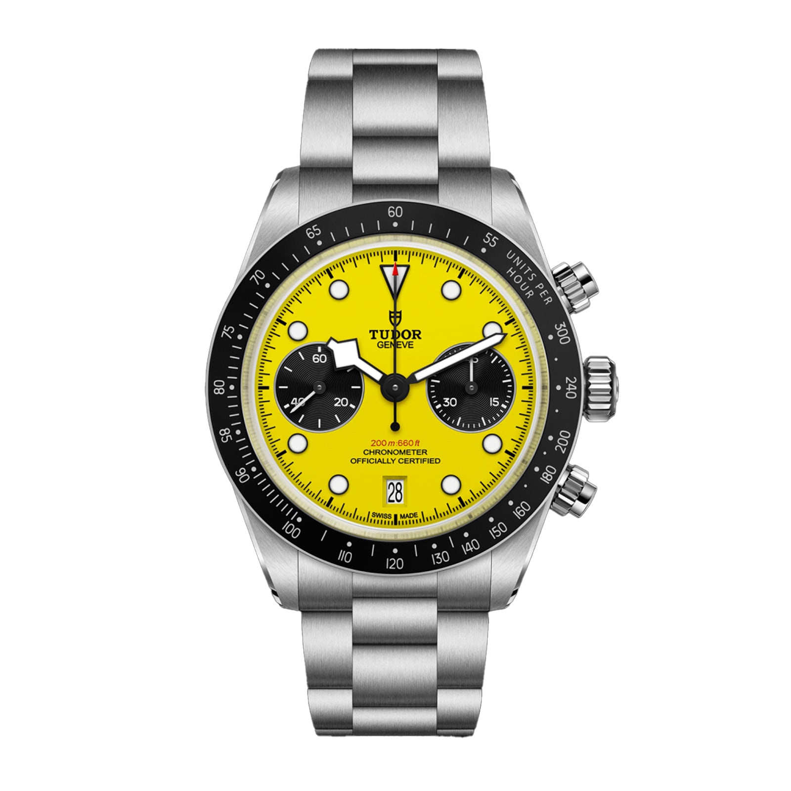
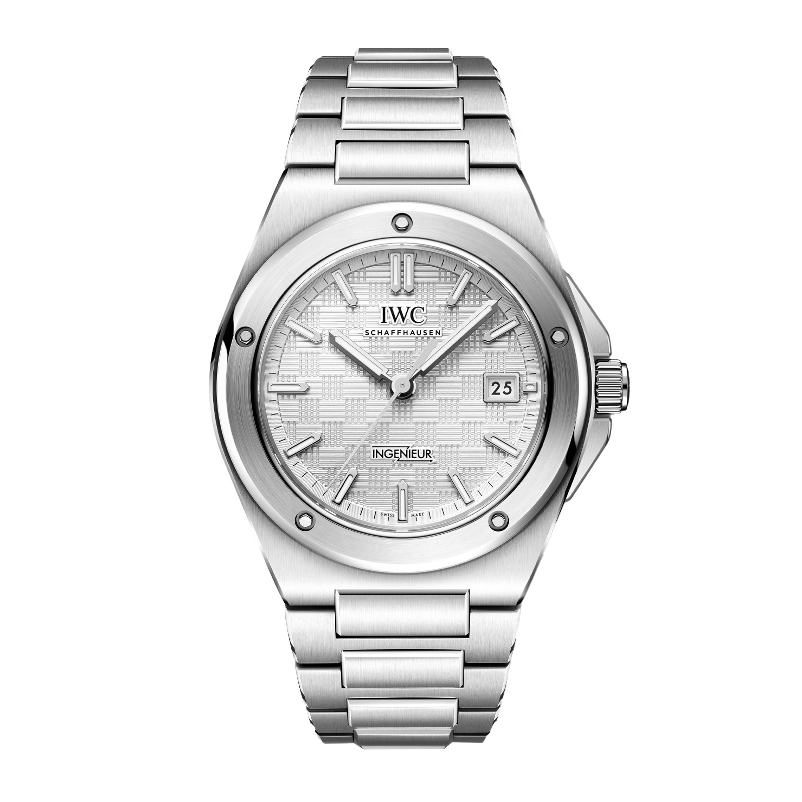
Scrolling Product Component
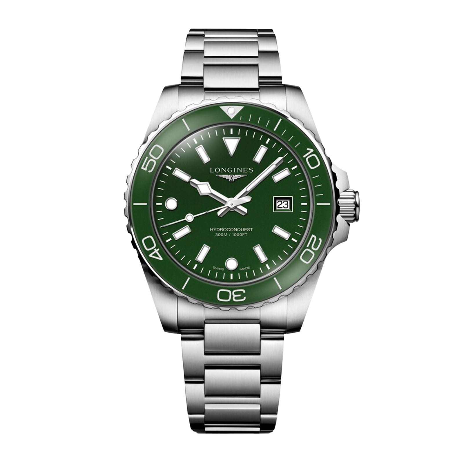
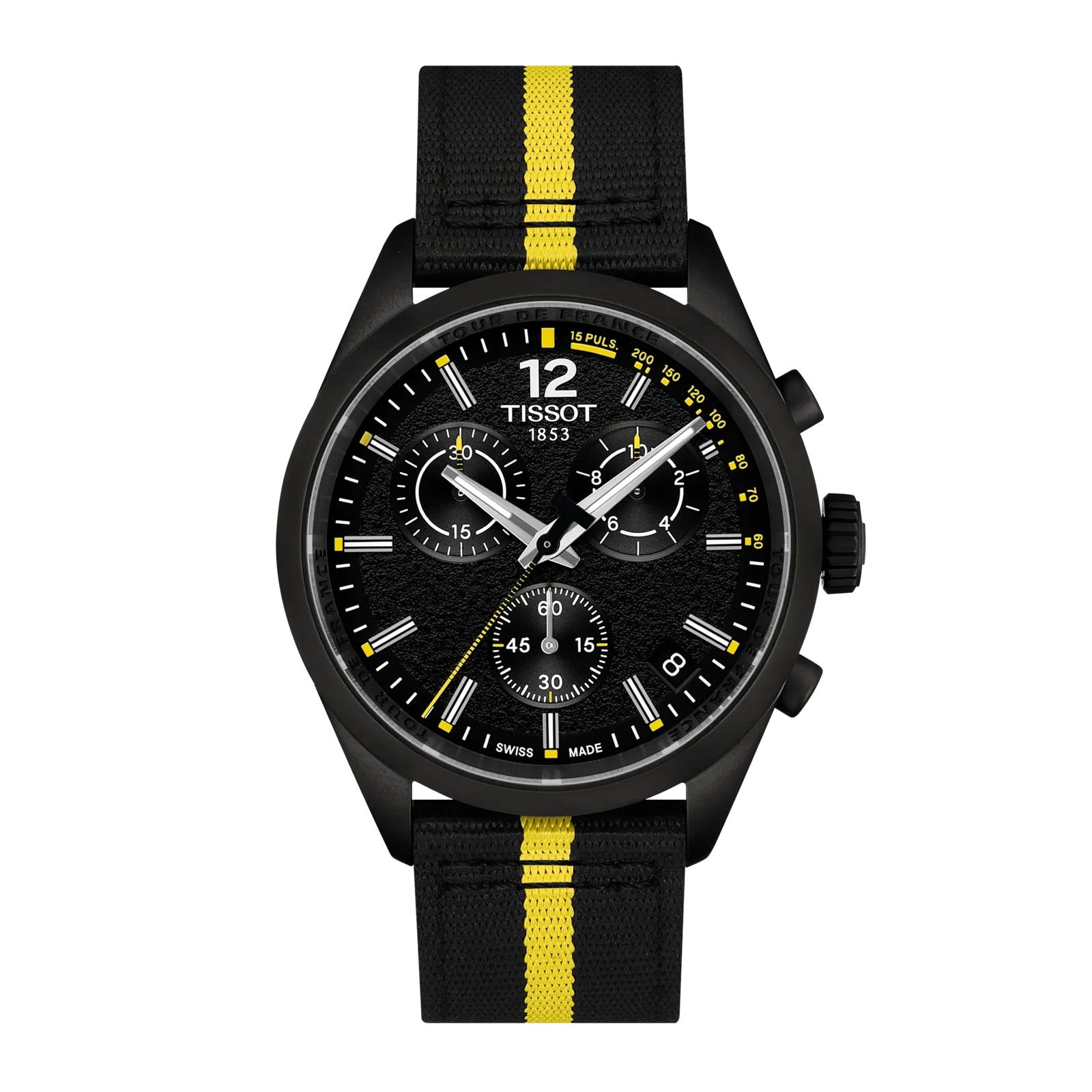
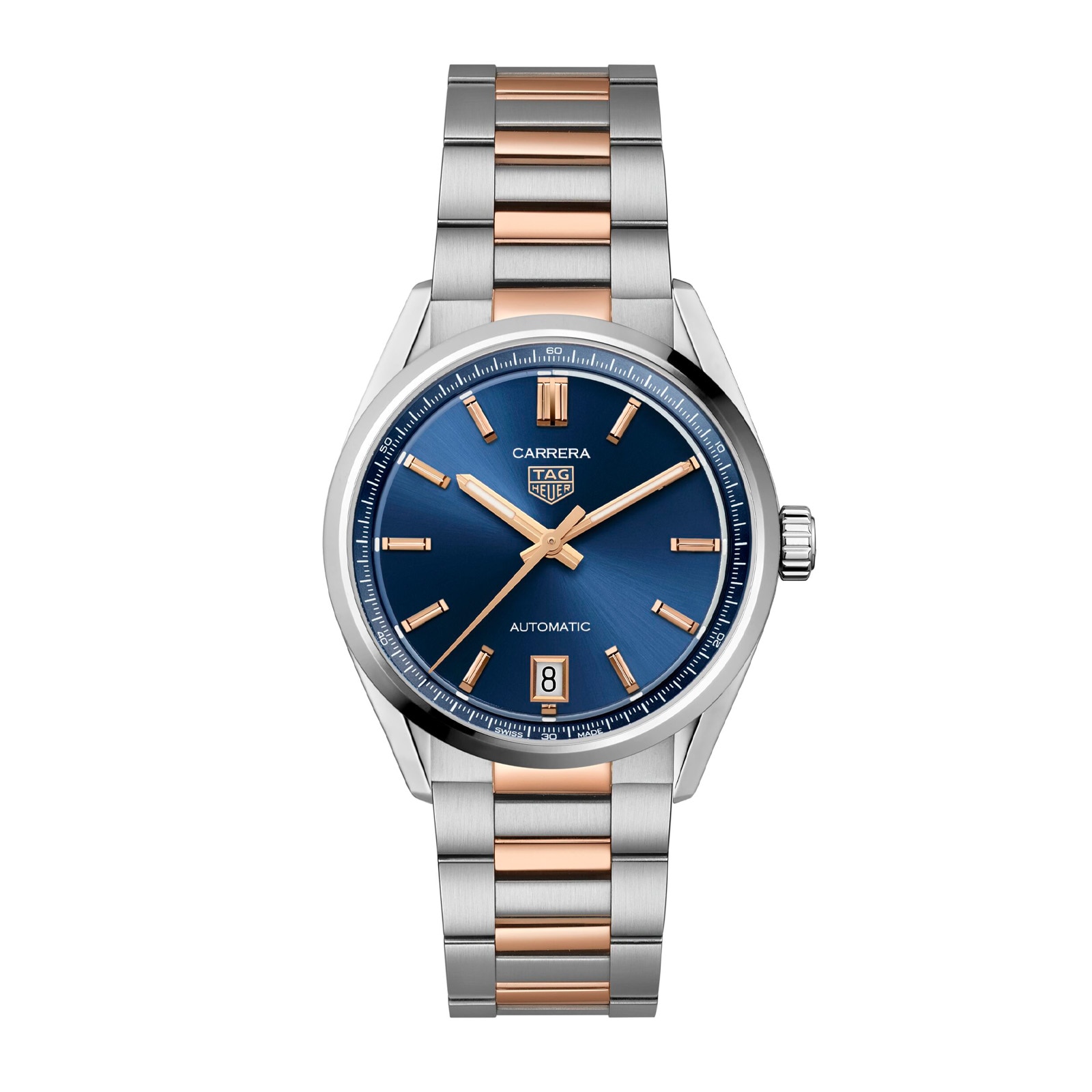
To any Four Wide Product Component - add the class wosgScrollAllComponent to make the product scroll & add navigation arrows.
This is 5 & peaking on desktop, 3 & peaking on tablet and 2 & peaking on mobile.
The Link is hidden so the product can scroll so you will have to add the link into the sub-title in an < a > tag like in the below component:
Up to 50% off
Scrolling Product Component - Revert Titles
To Revert the titles to be left aligned & allow paragraph text to be added also add the class wosgRevertTitles to the component.
Make sure to set Title and Sub Title to Left Aligned for this to work.
Lorem ipsum
Ut enim ad minim veniam, quis nostrud exercitation ullamco laboris nisi ut aliquip ex ea commodo consequat.
Scrolling Product Component - Custom Button
If you want a button that sits below the product component, make sure your product component has no padding-bottom added and then add this in a html block directly below.
To change the button colour change the inline styling in the html.
Scrolling Product Component - One & Peaking Mobile
to make the mobile scroll option 1 & peaking instead of 2 & peaking - add the class wosgOneWideMob to the component like the below.
This can be used alongside the revert titles class (like below) or without.
Lorem ipsum
Ut enim ad minim veniam, quis nostrud exercitation ullamco laboris nisi ut aliquip ex ea commodo consequat.
MP4 Video with Cover Image - Standard
Video Component with a poster image for mp4 videos.
Please remember to replace poster image 1700px by 960px.
Add class containerFullWidth onto the div with class container to make full width.
Please remember to update the aria label saying what the video is if there is no descriptive title for the video - if you are including a title & copy which tells you what the video is about, please delete the aria-label on the video tag.
Titles - you can move these to be above or below the video. Just move the div with class vid-title to sit below the the div col-md-12 that the video sits in.
just delete the div with class vid-title if you do not want a title.
to make the video square on mobile add class wosg-video-mob-square next to the class cmsContainer but make sure it doesn't crop any text in the video - you might need to used the version instead.
Ask a dev if you want the video to play on loop or muted or have any other questions!
Versions:
Lorem Ipsum
Lorem ipsum dolor sit amet, consectetur adipiscing elit, sed do eiusmod tempor incididunt ut labore et dolore magna aliqua.
Link Example
Mp4 Video with Cover Image - Full Width
Full Width Video with no title - make sure to update the Aria label
Mp4 Video with Cover Image - Desktop & Mobile Videos
Has links for a seperate mobile & desktop version of the video, for when the desktop video can't use aspect ratio on mobile to make it squarer - example this one from bespoke the writing would have been cropped without using 2 videos.
Make sure to add a mobile and a desktop poster image.
Mp4 Video with Cover Image & Custom Button
Youtube Video
Standard Youtube video html
Youtube Video with Cover Image
Video Component with cover image and custom button for youtube videos. (have used Rolex for an example).
Make cover image width="1682" height="946"
Leave the image alt tag empty, but remember to update the iframe title - usually update this to the title of the video on youtube.